Table of Contents
After you have downloaded the Plotmeister tarball, simply unpack it in your preferred target directory:
$ tar xfvj plotmeister-0.3.0.tar.bz2
To set up all required path entries, source the file unix_sourceme.sh in
your current terminal (shell) or add it to your .bashrc. Hence, it works with
the bash, it is supposed to work with dash as well (not tested).
$ cd plotmeister-0.3.0
$ source unix_sourceme.sh
We show you how to use the Plotmeister tools in an example.
Let’s assume you have written a program that performs some computations and you want to time and to evaluate the execution time. In the example below you find a simple shell script that performs a number of calls to a python script that computes the faculty of a given integer parameter.
Test program (fac.sh).
#! /bin/bash

for t in $(seq 1 3);
do
    for i in $(seq 0 1000 50000);
    do
        echo "n=$i"
        time python fac.py $i;
    done
done
You could capture the output in a file called fac.res (for result data).
$./fac.sh > fac.res 2>&1
The content of fac.res looks like this:
n=0

real    0m0.014s
user    0m0.016s
sys     0m0.000s
n=1000

real    0m0.014s
user    0m0.008s
sys     0m0.000s
n=2000

real    0m0.018s
user    0m0.012s
sys     0m0.012s
n=3000

real    0m0.023s
user    0m0.020s
sys     0m0.004s
n=4000

real    0m0.032s
user    0m0.016s
sys     0m0.004s
...
When we look at the output above we see that the value of the parameter n is
printed at start. After that we see the output of the time command that
consists of real, user, and system time.
To parse this results file we have to create a Plotmeister template file.
We have two options:
- simple template format.
- extended template format.
The simple template format should be enough in most cases. To create a simple template we simply copy the output of one experimental run into an editor, e.g., from
n=0

real    0m0.014s
user    0m0.016s
sys     0m0.000s
Then we remove the empty lines and start to substitute the values that should
be retrieved by variables. We start with n=0. We are interested in the value
of n. Thus, we write n=@{i,n}. That means that we want to read the value
of n which is an integer and this value should be named n in the output.
Hence, @{} denotes the variable. We proceed the same way with the real, user
and sys time. But in these cases we need to tell Plotmeister that it should
look for floating point values. Thus, we write for example @{f,real}. The
character # has a special meaning in the simple template and means that
"multiple whitespaces are allowed".
At last, we have to tell Plotmeister how often one of these lines does occur
in the output. To do so, we first have to enumerate the lines 1:,2:,…
Then we tell in the states line how often a line occurs in the sequence of
the given lines. In our example each line is printed only once before the next
line starts. Thus, we say states: 1 2 3 4.
The code below shows the resulting simple template for our parsing problem:
Template fac.tpl (simple).
1:n=@{i,n}
2:real#0m@{f,real}s
3:user#0m@{f,user}s
4:sys#0m@{f,sys}s
states: 1 2 3 4
Internally, the simple template is transformed into a sequence of regular expressions. In case that the users want to have direct control over the parsing process or they need to extract values that are not provided in the simple template (e.g., date formats, etc.) then you can write an extended template.
The following extended template shows the corresponding template for our
example. Here, we again declare the lines that should be parsed. In contrast
to the simple template we specify the regular expression directly. After all
lines have been defined we have to identify the variables by naming them. For
example 1,1:n means that the first variable in line 1 is called n.
Template fac.tpl (ext).
1:n=(\d+)
2:real\s+0m([\d\.]+)s
3:user\s+0m([\d\.]+)s
4:sys\s+0m([\d\.]+)s
1,1:n
2,1:real
3,1:user
4,1:sys
states: 1 2 3 4
Now we can finally start parsing the data.
To do so we print our results file to stdout and pipe it to the Plotmeister parser.
In case you defined a simple template you would call:
$ cat fac.res | pm_parse_simple.py -t fac.tpl
or for an extended template you would execute:
$ cat fac.res | pm_parse_ext.py -t fac.tpl
The parser output will look in both cases like this:
#################
# cols=5
# rpt_cnt  n    real    sys     user
#################
0       0       0.038   0.008   0.012
1       1000    0.016   0.004   0.012
2       2000    0.025   0.008   0.012
3       3000    0.023   0.008   0.016
4       4000    0.027   0.008   0.020
5       5000    0.028   0.000   0.028
6       6000    0.040   0.000   0.036
7       7000    0.046   0.004   0.040
8       8000    0.056   0.004   0.052
9       9000    0.086   0.008   0.064
10      10000   0.084   0.004   0.080
11      11000   0.102   0.004   0.096
...
The parser outputs data in PMD file format. The first column contains a unique line number. The other columns are labeled as specified in the template, e.g., n, real, user.
In order to save the parser output we redirect stdout into a file called
fac.pmd.
$ cat fac.res | pm_parse_simple.py -t fac.tpl > fac.pmd
Okay, we have a PMD file containing the raw data of our results. Now we have
to decide which columns we want to plot. I suggest that we plot the user
time for each value of n. Thus, we first select these two columns from the
PMD table like this
$ cat fac.pmd | pm_select_columns.py -s n,user
The resulting output only contains the columns n and user.
#################
# cols=2
# n     user
#################
0       0.020
1000    0.040
2000    0.032
3000    0.020
4000    0.028
5000    0.032
6000    0.048
...
0       0.008
1000    0.008
2000    0.016
3000    0.016
4000    0.024
5000    0.036
6000    0.064
...
But since we timed a the execution time for one value of n three times we
also have three different user times for one value of n, in other words,
one x value (n) still has multiple values of y (user). So, we need to
apply a function on all values of user for one value of n. To do so, we
pipe the PMD table through pm_apply_to_column.py and compute the average
(avg) on the values of user.
$ cat fac.pmd | pm_select_columns.py -s n,user \
| pm_apply_to_column.py -c user -o avg
After computing the avg over the values of user the PMD table will look like
this:
#################
# cols=2
# n     user
#################
0       0.0133333333333
1000    0.0173333333333
2000    0.0213333333333
3000    0.0173333333333
4000    0.0253333333333
5000    0.032
6000    0.0493333333333
7000    0.0933333333333
8000    0.0653333333333
9000    0.0866666666667
10000   0.0986666666667
11000   0.118666666667
12000   0.14
13000   0.173333333333
14000   0.193333333333
15000   0.225333333333
16000   0.252
...
To create a nice plot Plotmeister makes use of dat2eps. (dat2eps is a
standalone program to create EPS plots. dat2eps comes with its own input
format, the dat2eps format. The dat2eps format contains the description of the
plot and the data to plot. This format is more or less independent of the plot
program, so that it can use different front-ends like Gnuplot or Matlab.)
In order to get our PMD file into a dat2eps file we need to convert it. We
call the program pm_conv2dat.py and denote that column n contains the
values of the x-axis and user contains the values of the y-axis.
$ cat fac.pmd | pm_select_columns.py -s n,user \
| pm_apply_to_column.py -c user -o avg \
| pm_conv2dat.py -x n -y user
The conversion leads us to the dat2eps input file which looks like this:
#@VERSION 0.9
#@SEPARATOR \t
#@COLHEAD(1)
0.0     0.0133333333333
1000.0  0.0173333333333
2000.0  0.0213333333333
3000.0  0.0173333333333
4000.0  0.0253333333333
5000.0  0.032
6000.0  0.0493333333333
7000.0  0.0933333333333
8000.0  0.0653333333333
...
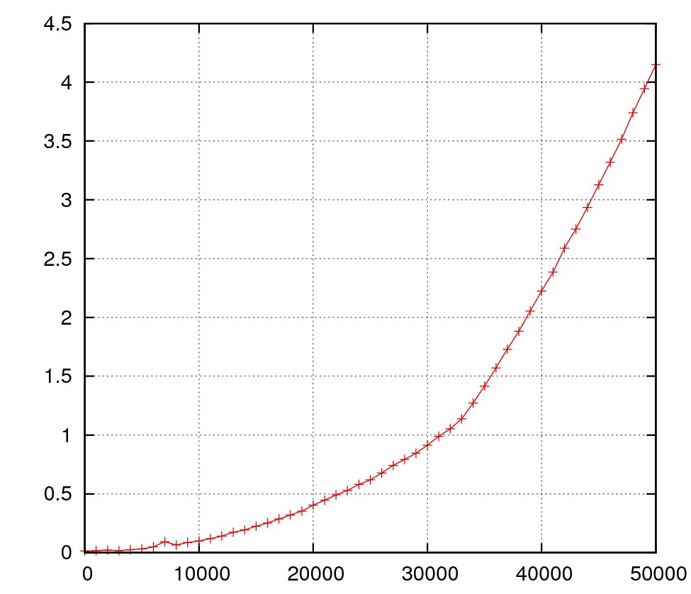
At last we simply pipe everything into dat2eps and only specify the output file of our plot.
$ cat fac.pmd | pm_select_columns.py -s n,user \
| pm_apply_to_column.py -c user -o avg \
| pm_conv2dat.py -x n -y user \
| dat2eps.pl -eps=fac.eps
The resulting plot graphic is shown below:
Plotting into a file with dat2eps is useful if you know what you want to
plot. If you just want to have a first look on the data or just wanna explore
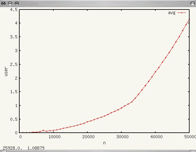
the data we feed the program plotmeister.py with our PMD table.
$ plotmeister.py fac.pmd
The screenshot shows the Plotmeister UI when started with the example PMD table.
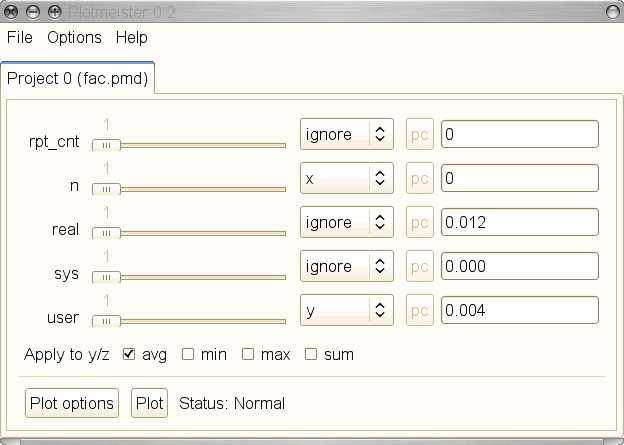
We can see that we get a slider and a drop down box for each column of the
table. In the drop down box we can select which column should be used to
provide the x or y values. To test the Plotmeister UI we use the same settings
as in the dat2eps example, n should provide the x values and user the y
values. Then we simply click on Plot and the following plot pops up: